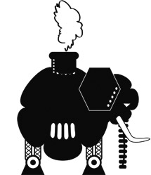
BROOKLYN INDIE MARKET will hold a Steampunk celebration this year (October 24th) that will include readings from steampunk themed books – including a selection from Steampunk Prime read by Nasty Canasta (of Naked Girls Reading) – as part of the Literary Corner sponsored by Tor Books. Readings begin at 11 am and Steampunk Prime is scheduled to begin at 3:30 pm. It turns out that Nasty, a star of NYC’s neo-burlesque scene, is a fan of old sci-fi movies and tv shows like Metropolis and Logan’s Run. We expect her to be in appropriate costume.
The Steampunk Market will take place on Sunday, October 24th, 2010 from 11 am to 8 pm at the DUMBO Lofts at 155 Water Street in DUMBO (Brooklyn), $5 admission. The market will feature many steampunk vendors and a fashion show at 4:00 pm.
(art by Luis Ortiz)

DAVID HOLLIS is trying to collect enough money to put together a documentary on one of our favorite artist Lee Brown Coye. Titled Lee Brown Coye, Master Beyond the Macabre, we believe this is a worthwhile project and if you feel like helping out you can jump to the Kickstarter website and check out some details of the project before funding ends October 10.

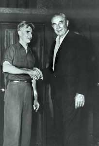
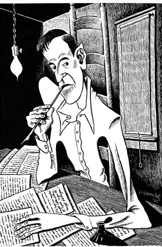
(Top photo by Robert Coye of his father Lee Brown Coye meeting Bela Lugosi, c. 1950. Bottom art is LBC’s depiction of H. P. Lovecraft.)

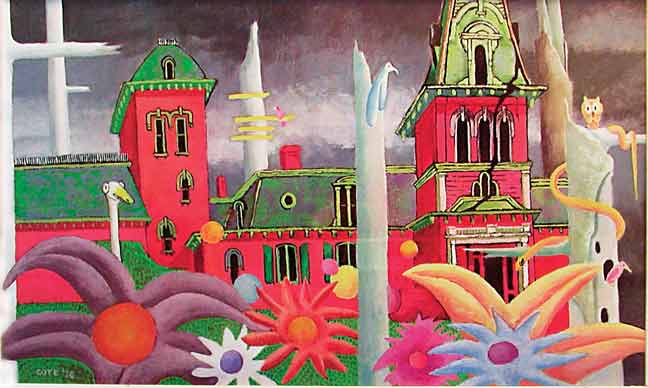
THE FOLLOWING IS ARTIST Lee Brown Coye’s explanation for the use of colorful circles in many of his paintings:
“Those are McGurty discs,” Lee replied…”Yes, McGurty discs. Philip McGurty made them years ago. You still run across them once in a while out in the country where I come from…McGurty was a farmer who lived a few miles from here. He had a hill farm. Hill farms are hard to work, but he was a good farmer and a hard worker, and he made it pay. But besides being a good farmer and hard worker, McGurty had a soul, he loved color, too, and would speak about the sunlight on a field of ripe wheat and the color of the wet ground when it’s first turned in the spring…
“On warm summer evenings he would sit on his stoop and watch the setting sun as it hit the top of a hill across the valley, and he would feel badly when it got dark and the bright colors had faded into night.
“He wished there was more color yet in the fields and hills and trees, and he thought, ‘There is a way to get it there.’
“McGurty’s first move was to get some old boards which he cut into various size circles. These he painted in bright colors. Reds and yellows mostly, because they would stand out better against the background of a green trunk or a dark hill. He took the wooden discs and nailed them around on trees and fence posts. When he sat on the stoop in the setting sun, they glowed and he was happy with the work he had done.”
On different occasions Lee would vary the story. In another version a windstorm toppled an old straight oak tree on McGurty’s farmyard. The straight trunk gave McGurty an idea and he began sawing the tree into slices. Before long, there were many new yellow, red, blue and orange discs scattered around the farm. Strangely enough, one of the tree slices took root and over the years grew into a full tree bearing hundreds of discs like seedpods.
(From Arts Unknown: The Life and Art of Lee Brown Coye.)
(Art by Lee Brown Coye for THE FALL OF THE HOUSE OF USHER.)

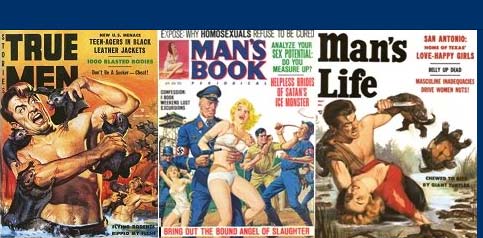
Subtropic Bob recently did an interview with me for his blog Men’s Adventure Magazines. We talked mostly about Cult Magazines, A to Z: A Compendium of Culturally Obsessive & Curiously Expressive Publications.

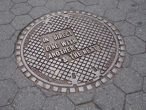
THERE IS A MANHOLE COVER in Union Square Park that I pass all the time. It was cast years ago as part of some New York City Public Art Fund and the raised letters on its surface read: IN DIRECT LINE WITH ANOTHER & THE NEXT. I have no idea what this bit of doggerel means, but every time I see that manhole cover I think of the metal type used in letterpress printing. Back in the early 1990s one of my first jobs was in a typesetting shop not too far from the Holland Tunnel entrance. The place had been in business since 1919 and was manned by a bunch of old-time typesetters. When I got there they were using a photo-typesetting system and just beginning to changeover to digital. I was hired to teach these guys “computer typesetting.” One of them, named Eddy, straight out told me he had no interest in learning another typesetting system and planned to retire the next year. Now in the corner of the loft where I worked there was an antique looking hulk of a machine with a massive keyboard. I learned that it was an old hot-metal Linotype Composer kept by the owner as a memento of the shop’s early history. Eddy seeing my fascination with the Linotype fired it up one night. Any steampunk fan would have been in ecstasy watching man and machine working in total accord. The Linotype worked by using a keyboard to create letter impressions in a matrix, then molten lead, heating within the machine, was poured into this matrix to create lines of type slugs. Eddy was clanking along, looking to my eyes like the Phantom of the Opera at the keyboard, when the Linotype suddenly made a strange hissing noise and began spitting out molten lead. We both drove for cover. After the Linotype cooled down a bit Eddy patted it and with a big smile on his face said, “Just like the old days.”
(Photo: Luis Ortiz)

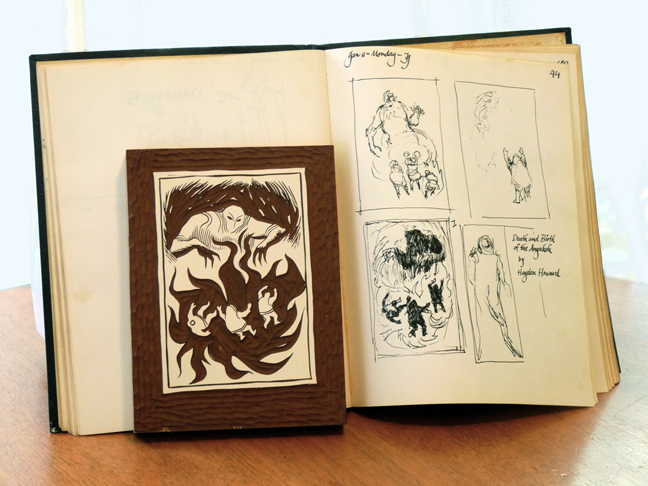
THE PICTURE ABOVE shows a linocut that Phoebe Gaughan found a few months ago while going through her husband’s papers. It turned out that the linocut illustrated the novelette “Death and Birth of the Angakok” by Hayden Howard. The story appeared in the April 1965 issue of Galaxy Science Fiction Magazine. She was also able to locate Jack’s sketchbook page that corresponded with the block’s design. It seems that Jack did this linocut as a design exercise (certainly the print from the block would not had reproduced too well on the cheap paper stock that Galaxy was using at the time) and he ultimately used pen and ink for the finished art. In January of 1965 Jack pulled a few proof prints off the block then moved on to his next illustration assignment. Forty-five years passed before Phoebe discovered the linocut and pulled the first edition from it. The print is now available from Nonstop Press.
(Photo: Phoebe Gaughan)

Jeff VanderMeer recently wrote on his blog about publishing in the future:
—In all likelihood, making a living as a full-time writer will be impossible unless you are already the leader of a junta, gang, or militia and have the resources to put out your own Mein Kampf. If you are in this position, you will have a built-in captive audience for your writings.
— Most writers will make their living selling metal scraps, human meat, and edible weeds.”
Jeff is being tongue-in-cheek here but I think that in the post-print-apocalypse future he envisions it is more likely that tattoo artists will become the new publishers. Like Robert Mitchum in Night of the Hunter with L-O-V-E and H-A-T-E tattooed on his knuckles or Queequeg in Moby Dick, people will still need some outward display or insignia to warn or show strangers their affiliations. Since most people in Jeff’s dystopic future will be unable to read they will see letters more as symbols and literate tattoo artists/authors can ink whatever prose or poetry suit their sensibilities. Of course, if most of humanity has becomes cannibalistic then we are talking about ephemeral editions – or, in some cases, imprinted skin can be saved like parchment, which can also be boiled down into soup stock if times really get hard.

NOT too long ago I was looking through some old Ace Books anthologies from the 1960’s. I noticed that quite a few had interior black and white illustration. This seemed a common practice back then, but is rarely done these days. Indeed, Harlan Ellison went out of his way to get Leo and Diane Dillon to do header illustrations for every story in his first Dangerous Visions book published in 1967. For the second DV volume he had artist and film-maker Ed Emshwiller doing the artistic honors. I always thought the black and white illustrations added much to the appeal of these books. At Ace Jack Gaughan did interior black and white drawings for many of the annual World’s Best Science Fiction series published during the decade. Nowadays a publisher like Fantagraphic Books (better known for it graphic novels) will put out a book that is mostly text and includes some illustrations, but in general illustrated books has been abandon by most non-children’s book publishers.
I find I miss this practice in many of the anthologies I read today and so when presented with the opportunity to design the book jacket for Mike Ashley’s collection of vintage science fiction (Steampunk Prime) I decided to follow in the footsteps of the Dillons, Emsh, and Gaughan, and create 16 story illos for the book. I have been doing advertising art for so long that I had forgotten how exhilarating it was to actual create illustrative art not geared to pleasing marketing people and focus groups. I hope to do more interior illustrations for other books in the future.
And if Harlan Ellison ever gets around to doing the Last Dangerous Visions – which he has been working on for many years now – I would love to design the book jacket and illustrate every story.
(Illustration: Luis Ortiz, from Steampunk Prime)
WELCOME to NonstopID, our brand new info, news, and whatever blog. After talking about doing one for a while now we thought it was about time we jumped in. On this page, you’ll hear mostly from Nonstop Press Senior Editor Luis Ortiz (me), and also from some special guests. I also hope to hear what you, our readers, have to say.
